JavaFX は画面のデザインを CSS で自由に変更することができます。JavaFX 2 では Caspian、 JavaFX 8 以降は Modena と呼ばれるデフォルトのスタイルが用意されています。このデフォルトのスタイルは立体感のあるデザインで、 どことなく Windows XP 時代のような古めかしさを少し感じさせます。
CSS をカスタマイズして、 Web やモバイルで主流となっているフラットデザインに変えてみましょう。今回はスクロールバーです。
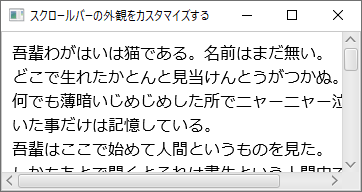
デフォルトのスタイル Modena
JavaFX 11 でそのままスクロールバーを使った場合の外観はこのようになります。
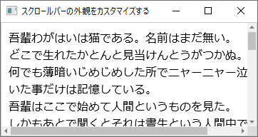
Windows 10っぽいスタイル(矢印ボタンあり)
Windows 10 のエクスプローラーや Chrome のスクロールバーに似せてみました。
Windows 10っぽいスクロールバー.scroll-pane .corner {
    -fx-background-color: #DCDCDC;
    -fx-background-insets: 0;
}
.scroll-bar {
    -fx-background-color: #F1F1F1;
    -fx-background-insets: 1;
    -fx-padding: 0;
}
.scroll-bar .track {
    -fx-background-color: #F1F1F1;
}
.scroll-bar .thumb {
    -fx-background-color: #C1C1C1;
    -fx-background-radius: 0;
}
.scroll-bar .thumb:hover {
    -fx-background-color: #A8A8A8;
}
.scroll-bar .thumb:pressed {
    -fx-background-color: #787878;
}
.scroll-bar:vertical .thumb {
    -fx-background-insets: 0 1 0 1;
}
.scroll-bar:horizontal .thumb {
    -fx-background-insets: 1 0 1 0;
}
.scroll-bar .decrement-arrow,
.scroll-bar .increment-arrow {
    -fx-padding: 0;
    -fx-effect: null;
    -fx-background-color: #808080;
}
.scroll-bar .decrement-button:hover,
.scroll-bar .increment-button:hover {
    -fx-background-color: #D2D2D2;
}
.scroll-bar .decrement-button:hover .decrement-arrow,
.scroll-bar .increment-button:hover .increment-arrow {
    -fx-background-color: #505050;
}
.scroll-bar .decrement-button:pressed,
.scroll-bar .increment-button:pressed {
    -fx-background-color: #787878;
}
.scroll-bar .decrement-button:pressed .decrement-arrow,
.scroll-bar .increment-button:pressed .increment-arrow {
    -fx-background-color: #FFFFFF;
}
.scroll-bar:vertical .decrement-button,
.scroll-bar:vertical .increment-button {
    -fx-padding: 5 3 5 3;
}
.scroll-bar:vertical .decrement-button {
    -fx-background-insets: 1 0 0 0;
}
.scroll-bar:vertical .increment-button {
    -fx-background-insets: 0 0 1 0;
}
.scroll-bar:horizontal .decrement-button,
.scroll-bar:horizontal .increment-button {
    -fx-padding: 3 5 3 5;
}
.scroll-bar:horizontal .decrement-button {
    -fx-background-insets: 0 0 0 1;
}
.scroll-bar:horizontal .increment-button {
    -fx-background-insets: 0 1 0 0;
}
.scroll-bar:vertical .decrement-arrow,
.scroll-bar:vertical .increment-arrow {
    -fx-pref-width: 7;
    -fx-pref-height: 4;
}
.scroll-bar:vertical .decrement-arrow {
    -fx-shape: "M 50,0 L 0,25 L 100,25 z";
}
.scroll-bar:vertical .increment-arrow {
    -fx-shape: "M 50,50 L 0,0 L 100,0 z";
}
.scroll-bar:horizontal .decrement-arrow,
.scroll-bar:horizontal .increment-arrow {
    -fx-pref-width: 4;
    -fx-pref-height: 7;
}
.scroll-bar:horizontal .decrement-arrow {
    -fx-shape: "M 0,50 L 50,0 L 50,100 z";
}
.scroll-bar:horizontal .increment-arrow {
    -fx-shape: "M 50,50 L0,0 L0,100 z"
}
JavaFX は CSS の中で SVG パスデータを使って図形が描けるのがいいですね。ボタンの▲は -fx-shape に SVG パスデータを指定して描画しています。SVG パスデータの構文については下記を参考にしました。
矢印ボタンのないシンプルなスタイル
最近は Visual Studio Code や IntelliJ IDEA など矢印ボタンのないスクロールバーも流行っているようです。矢印ボタンなしの CSS も作ってみました。

矢印ボタンのない細くシンプルなスクロールバー.scroll-pane .corner {
    -fx-background-color: #DCDCDC;
    -fx-background-insets: 0;
}
.scroll-bar {
    -fx-background-color: #F1F1F1;
    -fx-padding: 0;
}
.scroll-bar:vertical {
    -fx-pref-width: 12;
}
.scroll-bar:horizontal {
    -fx-pref-height: 12;
}
.scroll-bar .track {
    -fx-background-color: #F1F1F1;
    -fx-background-insets: 1;
}
.scroll-bar .thumb {
    -fx-background-color: #C1C1C1;
    -fx-background-radius: 0;
}
.scroll-bar .thumb:hover {
    -fx-background-color: #A8A8A8;
}
.scroll-bar .thumb:pressed {
    -fx-background-color: #787878;
}
.scroll-bar:vertical .thumb {
    -fx-background-insets: 1 1 1 2;
}
.scroll-bar:horizontal .thumb {
    -fx-background-insets: 2 1 1 1;
}

.scroll-bar .decrement-button,
.scroll-bar .increment-button,
.scroll-bar .decrement-arrow,
.scroll-bar .increment-arrow {
    -fx-padding: 0;
}
-fx-pref-width、 -fx-pref-height の値でスクロールバーの太さを変えることができます。
サンプルプログラム
作成したサンプルプログラムは以下のリンクからダウンロードできます。([Gradle]プロジェクト形式になっています。)
最終更新日
2024-12-13